Student NPS was negative — −19.51% in Q1 2024. Thousands of open-text responses explained why, unreadably. I cleaned the year, tagged every comment, built the dashboard, and converted the four biggest themes into pitches carrying a combined +17.5 point expected gain.
Student NPS and satisfaction feedback, eleven institutions across AU, NZ and the UK.
Measurable. Tracked quarterly, reportable to the business.
Thousands of free-text comments — too many to read, too messy to prioritise against.
A score tells you whether something is wrong. Never what to build. All the value sat in the free text — and the free text was unusable raw.
Duplicates and blanks would have skewed every theme count. They came out before anything was tagged.
Student NPS and satisfaction responses across eleven institutions, split by assignment and exam.
Stripped before any counting, so theme volumes reflect distinct students rather than repeat submissions.
The clean denominator every number in this case study is calculated against.
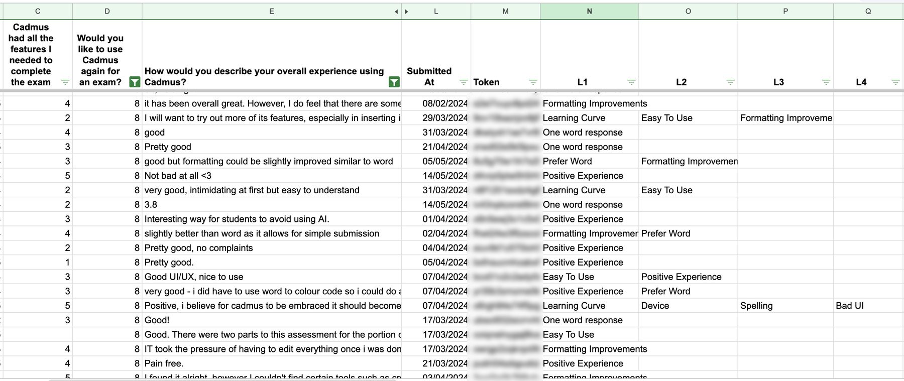
Four independent labels, not a hierarchy. One student can praise the interface, struggle with the learning curve, hit a device problem and complain about spellcheck in a single sentence. Forcing that into one category throws away three-quarters of the signal.
"One word response" exists deliberately — a bucket for noise, so answers like "good" could be excluded from theme counts rather than quietly inflating them.
1
2
3
Live 2024 response data. Submission tokens redacted; responses are anonymous by collection.
I started tagging manually. Accurate, and far too slow — the responses were too varied to compress by hand. My manager pointed out I was taking the long route.
Reading and tagging by hand. Accurate, but the throughput made a full year of data impractical to finish in any useful timeframe.
Used AI to apply the taxonomy at volume, then built the dashboard to visualise the distribution — cutting the analysis from a grind into something repeatable.
Not a report — a PRD with a section per theme, each carrying an explicit ask for Design and for Engineering. Pickup-ready, no second round of interpretation.
Not four opinions competing on rhetoric — four ranked volumes, each with a named owner and a defined ask. Spellchecker, the largest, is in build.
NPS was negative when the analysis began. Each pitch carries its own expected gain, sized from the students who raised that theme.
Estimated from respondent volume, straight from the PRD. Modelled, not measured — the case for investment. The measured movement is the trajectory above.
Students never reported “an editor problem.” They reported font size, then indentation, then double spacing, then typefaces — dozens of individually-small complaints.
Four low-priority items nobody schedules.
A hundred students describing one coherent gap — an Editor Improvements workstream with one design solution.
Bucketing symptoms up into a cause, then scoping against the cause, is what turned this into roadmap items instead of a backlog of noise.
Hand-tagging was accurate and far too slow. Generative AI for bucketing plus Excel to visualise made a full year tractable. The useful part isn't the tooling — it's dropping work I'd already invested in rather than defending it.